Calls to action—or CTAs—have forever been used in radio, print, and television advertising to prompt a purchase from a prospective customer. You might think of a commercial flashing “Call Now!” or a voice-over salesman asking you to “Get your FREE quote today!” These suggestive phrases are designed to convince an audience or prospect to take the next step toward a purchase, or move them along in their sales funnel.
However, in the context of modern digital media and websites, the call to action has grown to be a much more nuanced concept. On the web, CTAs don’t just encourage users to buy, they are also used as important markers that direct users how to navigate your website, and are crucial in creating a usable experience—and yes, to make a sale. Read on for 4 ways that you can up your online conversion game by making a stronger call to action.
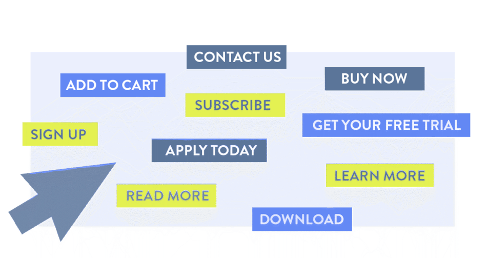
Make it a Button
It’s imperative that any call to action on a website must be clickable, so that the user can be linked or directed to a desired location, like a shopping cart or contact page. While it’s possible to link an image, or hyperlink inline text like this, the very most common and well-understood visual cue to click is the button. Your button should be in a color that stands out well on the page and have plenty of space around it. Here are a few examples of button CTAs that are commonly used online:
Make it Verb-y
One of the non-negotiable attributes of a good call to action is commanding, action-based language. You’ll notice that every button example above begins with an imperative verb, and that’s by design. Tell users succinctly and directly what you want them to do in just a few short words. Don’t get too creative with wordplay, and pick a phrase that best fits the individual circumstance. For example, if you are linking a user from an introductory paragraph about your company on your home page to a full, robust About Us page, you might use “Learn More”. Alternately, if you were prompting a user to read one of your blog posts, you might show a short preview of the article with the call to action of “Read More,” because reading is specifically what you’d want a user to do in that case.
Build Your Case
Unfortunately, it’s not always as simple as just putting a button on a page and letting the clicks the roll in; any good CTA must also be paired with good supporting copy, or anchor text, that lets the user know why they should click. Leading with the main benefit that the user can expect is a great place to start. For example, a credit card company might say, “Start earning cash back today. Apply Now.” The prospect of getting cash back provides a strong benefit to the user, and “Apply Now” communicates that you can take the next step in getting that card by applying right this minute.
In addition to focusing on benefits, you can also use language that reduces the perceived risk of the click ("Get your free consultation.") or provides a sense of urgency ("This sale ends Monday.").
Put One on Every Page
One of the most common mistakes we see on websites is the general lack of navigational calls to action—that is, a page that ends in a brick wall for users, giving them no choice about what to do next. As a rule, you should always provide a recommendation of the next page you want your users to visit after the one they’re currently on. The goal here is that a user will be able to keep clicking from page to page, all throughout the site and ultimately be guided to a final location that’s designed to convert that user (like a contact form or shopping cart).
As you create a new page, think about the logical next steps a user might be interested in taking and build in a call to action to get them there. For example, if the user is reading one of your blog posts, you might suggest any of the following:
- Read a selection of related blog posts.
- Subscribe to the mailing list to receive more blog posts.
- View another page of the website that speaks to the article's content, like a product or service offering.
Using these guidelines to create effective CTAs can make a dramatic, measurable difference in the performance of your website as part of your marketing strategy.
Ready to get started? For a personalized plan on how to make your website convert more effectively, reach out to Mostly Serious today.
(Hey, see what we did there?)